INTRODUCTION
CSS Grid Layout, commonly known as CSS Grid, is a revolutionary technique in web design that empowers developers and designers to craft dynamic and sophisticated layouts with remarkable ease and precision. Unlike traditional layout methods that often involve complex hacks and positioning tricks, CSS Grid offers a structured and intuitive approach to creating both rows and columns in a two-dimensional grid.
What is CSS Grid?
CSS Grid Layout, often referred to as CSS Grid, is a two-dimensional layout system that allows you to design complex web layouts with precision and flexibility. Unlike traditional layout methods that rely heavily on floats and positioning, CSS Grid provides a more intuitive and structured approach to creating layouts.
Why choose CSS Grid over other layout methods?
While CSS Flexbox is excellent for one-dimensional layouts, CSS Grid shines when it comes to building comprehensive and intricate layouts. With CSS Grid, you can create both rows and columns simultaneously, making it ideal for grid-based designs. It simplifies the process of aligning and distributing content within the layout, making it a preferred choice for modern web design.
Understanding Grid Containers and Items
Setting up a grid container
To get started with CSS Grid, you first need to define a grid container on the parent element. This is achieved by applying the 'display: grid;' property to the container’s CSS.
Placing items within the grid

Grid items are the individual elements placed within the grid container. By default, items will be placed in the order they appear in the HTML source. However, you can control their placement using line-based positioning or named grid areas.
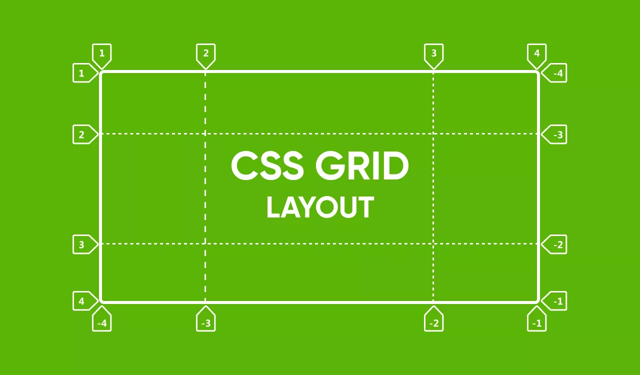
Creating Rows and Columns
Defining rows and columns in the grid

In CSS Grid, you have the freedom to define the number and size of rows and columns in your layout. You can use the 'grid-template-rows' and 'grid-template-columns' properties to establish this structure.
Conclusion
In conclusion, CSS Grid Layout is a game-changer in the world of web design and layout. Its ability to create complex, responsive, and flexible layouts with ease is unparalleled. By understanding the fundamental concepts and benefits of CSS Grid, you’re well on your way to becoming a proficient layout designer.
If you’re a web developer or designer looking to create efficient and flexible layouts for your websites, CSS Grid Layout is a powerful tool that you should definitely consider adding to your skill set. In this comprehensive guide, we’ll walk you through the basic concepts and benefits of using CSS Grid for layout design. Whether you’re a beginner or have some experience with CSS, this guide will provide you with the foundational knowledge needed to harness the full potential of CSS Grid.
FAQs
1. Is CSS Grid better than Flexbox for layout design?
A: CSS Grid and Flexbox serve different layout purposes. While Flexbox is great for one-dimensional layouts, CSS Grid excels in creating two-dimensional grid-based designs. The choice depends on your specific layout requirements.
2. Does CSS Grid work in all web browsers?
A: CSS Grid is well-supported in modern browsers. However, for older browsers, you might need to use vendor prefixes or consider alternative layout strategies.
3. Can I use CSS Grid alongside other layout methods?
A: Absolutely! CSS Grid can be combined with Flexbox and other layout techniques to achieve even more versatile designs.
4. Is CSS Grid a replacement for frameworks like Bootstrap?
A: CSS Grid is a layout tool, while frameworks like Bootstrap provide a comprehensive set of design and UI components. You can integrate CSS Grid into frameworks to enhance layout capabilities.
5. Where can I learn more about advanced CSS Grid techniques?
A: There are many online resources, tutorials, and courses available that delve into advanced CSS Grid concepts and techniques. Keep exploring and experimenting to master this powerful layout tool.

unde et enim animi repellendus sed dignissimos quae sunt aut et voluptatem nemo facilis sed fugiat eaque minus dolor. quia modi dolores ex quam omnis totam ut dolores hic ipsa consequatur cum. deleniti sapiente similique aliquam similique quae autem. aut consequatur labore optio nam voluptatem ut aut nemo aut rem iusto maiores delectus sit eum consequuntur molestias explicabo corrupti enim. non nisi maxime voluptas eveniet vel voluptatum hic nemo laboriosam minima distinctio laboriosam natus vel.